Allowed Blog
Design Tips for Your Custom Cups
Published on 1/1/2026
Less is Often More
When designing your custom cup, it's tempting to fill every inch with graphics, text, and patterns. However, the most effective designs are often simple, bold, and instantly recognizable. A cluttered cup can be overwhelming and fail to communicate your core brand identity.
Key Branding Elements
- Logo Placement: Ensure your logo is visible when the cup is held naturally. The center of the cup, slightly above the midpoint, is usually the prime real estate.
- Color Palette: Stick to your brand colors for consistency. Use a Pantone-matching reference if possible to ensure the printed color matches your store signage and digital presence.
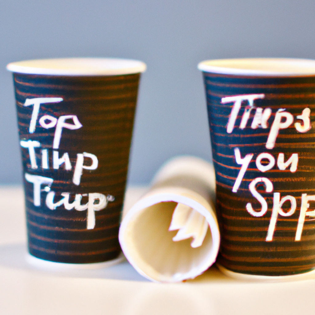
- Readable Text: Keep slogans short and fonts legible. Remember, the cup surface is curved, which can distort text that is too wide or too small.
Need help? Our design team can guide you to create a cup that pops. We have templates and expertise to ensure your vision translates perfectly from screen to paper.